
As part of our Kickstarter for BEOWULF Age of Heroes our mighty backers unlocked a series of PDF adventures. The very last of these is The Triple Serpent by Gareth Ryder-Hanrahan, and we’re finishing up production of that adventure right now – it should be released this month!
Jon has been painting the cover to this adventure, and he takes up the story with this look at the process.

Jon:
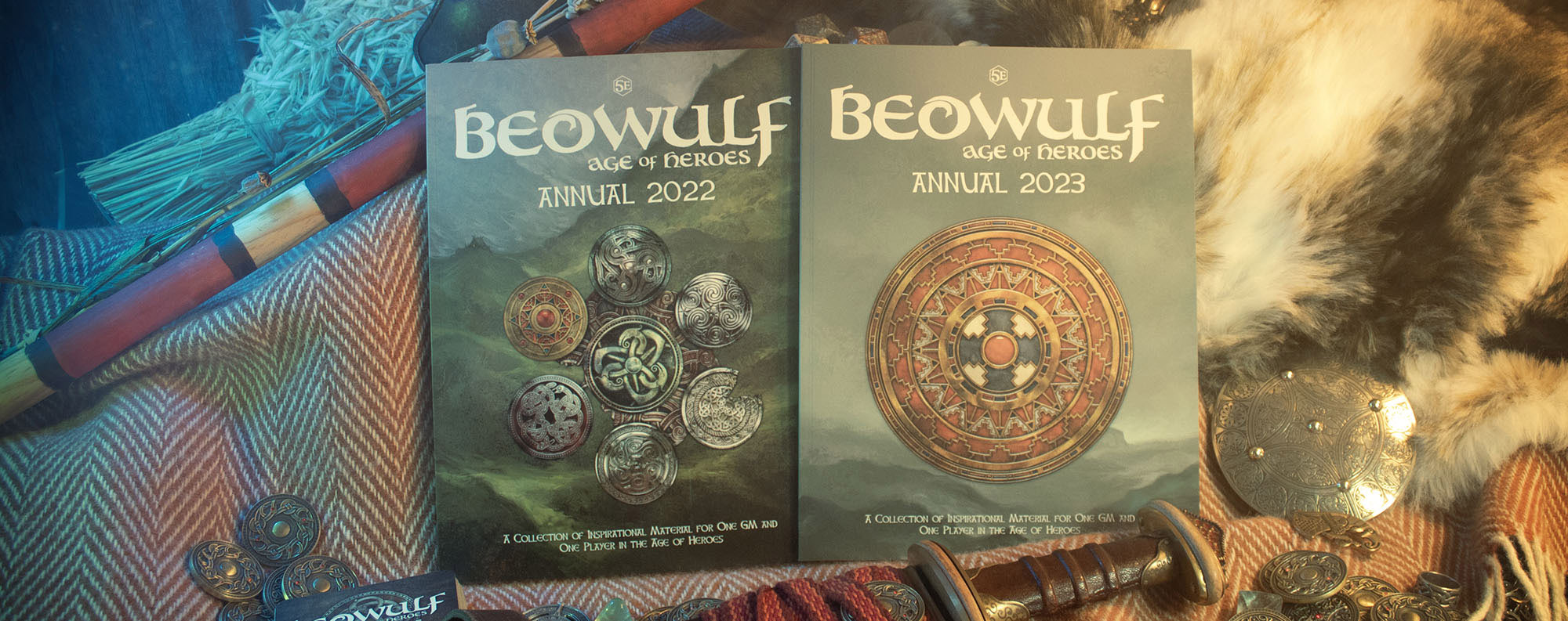
Beowulf adventure covers have a kind of language that threads through them. They each feature a circular icon by Paul Bourne. These have been a key part of BEOWULF, and one appears on the core rulebook in shiny spot varnish, tying the whole line together.
They also generally have some kind of triangular shape rising up from the bottom of the image – again echoing the corebook cover. Sometimes there’s a tiny ship heading towards the adventure location, sometimes not. Sometimes there are characters heads, sometimes not. These elements come in and out of prominence of each cover, but hopefully provide a thread that winds through them all, providing some kind of cohesion.
I’ll be entirely honest that when it came time to sit down and paint the cover to Gar’s scenario I was a bit vexed. I wanted it to be really really good, and that’s always a really bad place for me to start. I tend to work quite happily by messing up perfectly good pieces of paper and white digital canvases, and then refining the mess until it looks like something I’d imagined it might. Setting out with a goal like “be really really good” is highly corrosive to one’s confidence and forward momentum. We can’t alway control these things. I’m a massive fan of Gar’s work, and I didn’t want to let it down. But as they say: perfect is the enemy of good (or sometimes “the enemy of done”) and that was the case here.
Eventually however, I got over myself, and work began!
Here’s my initial sketch, made in Photoshop. On this occasion I worked in layers, figuring out which elements I wanted to include, and moving them around until I was happy with the proportions and layout. I am really cautious about spoiling the adventure, both here and on the cover, but I knew I wanted to include an early medieval Irish church on an island, a hall inside a ring fort, 3 characters, and Paul’s icon.

At this point we didn’t have the icon, so I asked Paul to make it – the scenario’s title (The Triple Serpent in case you missed it) really leads the way, so that was a nice easy one to work out. Here’s what Paul sent in. Beautiful:
With that we had all the necessary stuff in place to start the painting.
I use Artrage a lot in my digital work – the oil brushes in that app make for a wonderful squishy mess that you can push around and make some big shapes. So fairly rapidly I painted this big mess over the sketch. I worked out colours on the canvas, allowing colours to come to the fore as I worked. Sometimes I plan out a colour palette, other times I let it follow its own path.

I was about to say that I didnt have a strong idea of the colours I wanted here, but that isn’t the case. I had a strong feeling. The scenario is very definitely set in Ireland, and I wanted that to be reflected to some degree in the colours, while avoiding super awful clichés like “The Emerald Isle” (literally “thanks Obama”). That’s quire a fragile idea and hard to put in words. But I’ve seen a little bit of Ireland, and certainly looked at a lot of photographs of the scenery there. Just like my native Scotland I think the “feel” of Ireland gets misrepresented in cliche.
I also wanted to reflect some of the feel I got from reading the scenario. Which is tremendously hard to put into words – to some degree I’m a synaesthesic, so I can experience some crossover in senses.
The shape of the inverted triangle in the lower half of the image naturally grew, and I liked it. It’s sort of a reflection, but made of landscape rather than on water. There’s a lake in the scenario so that seemed right. The light in the doorway is a frequent motif of BEOWULF imagery. That literal “point of light” of the Meadhall is another visual element that feels right.
From here I moved into Procreate on my iPad. This makes for a highly mobile work station, and I was able to work late into the evening refining the image. Here’s a compressed video of progress.
You can see the character heads come in, and go away again in the video. I experimented with these, but never quite felt they worked. This motif appears on the cover to Horror at Herrogate, and I really liked them there.

This time out I just felt the painting looked better when I removed them, so I took the decision to leave them out. That troubled me a little, as I think I like images without figures, but people in general like to see some characters. The balance of what I project onto the audience and what I think I feel myself is a constant source of internal struggle. Sometimes you just have to go with your gut.
So here is the finished image, minus trade dress. We’ll be adding that today! And I’ll probably mess about with it some more before release. Because I’m annoying that way. 🙂

Keep an eye on our BEOWULF DrivethruRPG page for The Triple Serpent.
If you enjoyed this look behind the scenes, the BEOWULF Art Book is out now, with a look at some of our favourite BEOWULF art pieces with commentary from Jon.

